The HUD's of Zelda
“Zelda… Oh the memories.” These were the words spoken by Legend of Zelda series creator Shigeru Miyamoto upon his appearance at E3 2004while revealing the first look of The Legend of Zelda: Twilight Princess. As a die-hard fan of the series, I cannot agree more, Miyamoto-san. Being my favorite videogame series of all time, the adventures, and memories I have created with the Zelda series are among the most treasured that I hold in my heart. Since the series is celebrating its 35th anniversary this year, I thought I would look back at some of the notable titles of the Zelda series but with a twist… I am going to be analyzing the HUD (heads up display), UI (user interface) and overall user experience of the major titles of the series.
The HUD and UI are very integral factors in your adventure through Hyrule, as they stay visible throughout the entirety of the gameplay. The overall workings of these visual factors as well as how the player must navigate to perform certain tasks truly come together to make the series the great franchise that it is known to be. I will be analyzing the look and interaction, the level of distraction it brings to the player, as well as the seamless experience it can be to navigate and interact with the visual elements of each game in question. It’s dangerous to go alone… so let’s do this together.
Zelda 1 (NES)
The one that started it all, The Legend of Zelda. Zelda 1has a pretty basic, yet effective HUD. The first Zelda game established some very long-lasting staples to the franchise, such as showing a bar with Link’s hearts, the player’s rupee count, and most importantly: items that are assigned to specific buttons. Though the NES had only two main face buttons, the fact that individual items such as your boomerang, bow and bombs could be assigned to your face buttons was a revolution in the action/adventure genre. Showing the count for rupees, keys and bombs was a nice addition as well so players don’t have to go back to their pause menu to see how many they have. I personally think one of the most important parts of the interface implemented in Zelda 1 is the inclusion of the map on the top of the screen. This was useful in dungeons and the overworld when orienting yourself in the world of Hyrule and it is nice that the player doesn’t have to pause the game every time the map needed to be accessed.
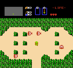
Link facing some octorocks in zelda 1

The final level of zelda 1
A Link to the Past (SNES)
I feel as though A Link to the Past is the true successor to Zelda 1 (since Zelda 2 was a side scrolling RPG…). When it comes to the UI and HUD there are some minor but influential changes. First of all, the SNES added two new face buttons, which lead the B button to be dedicated to the sword and the A button to be the first ever “action button” that performs actions such as picking up objects, running and interacting with NPC’s and signs. Y is the item assign button while X is to pull up the overworld map which is surprisingly helpful. A Link to the Past also introduces the magic meter which is very handy to have as part of the HUD- though it’s important to note its vertical orientation in this title. A Link to the Past again reuses the idea of displaying Link’s bomb and rupee count like in Zelda 1, but instead of keys the third indicator is for arrows.

The hud from a link to the past is a great step up from Zelda 1

The item select screen from A Link to the past
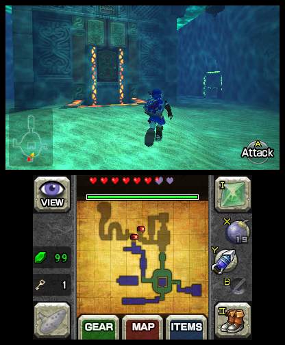
Ocarina of Time/Majora's Mask (N64/3DS)
These two games were beyond revolutionary on the Nintendo 64.From introducing lock-on targeting, to a formal open world, to just flat outbringing the Zelda franchise into 3D, Ocarina and Majora deserve all the praise given to them. When it comes to the HUD’s though… there’s a lot to be desired. These two games have every face button on the N64 controller as a part of their HUD. The A and B buttons as the action button and sword respectively, and the three C buttons which can be assigned to items. In my opinion the A and B buttons stick out like a sore thumb with their placement at the top of the screen and are a tad bit of a distraction to the player. From my experience with ALTTP, I feel as though the A and B buttons shouldn’t be present as a constant visible reminder to the player after figuring out what button does what. The B button is simple to understand- it’s for the sword and that’s its only use. The A button on the other hand would normally tell the player what todo (climb, roll, read, put away, etc.) but after a few small hints from your fairy companion, Navi (this could add to her hate, I know) these commands and actions could be easily learned and remembered by the player for future use in the game. On the other hand, the inclusion of the C button is integral to the user interface. The player should not have to memorize the placement of their items on the C buttons and the visual indication the game provides helps a lot. A magic meter is also present, but this time it is horizontal since Link can upgrade it, increasing the length of the meter.

the hud from ocarina of time is a little messy
The menus on the other hand are its own story. The start menu is divided into four panels: map, quest status, gear/equipment, and items. The four panels work in tandem very well and provide the player with proper information and feedback when interacting with them. The problem occurs when using some of the gear in the equipment section. In certain dungeons such as the Water Temple and Shadow Temple, the game requires Link to equip either the iron boots or the hover boots to complete a task. The problem is the player must pause the game, scroll to the equipment section, equip the boots, unpause the game, and finally bask in the fruits of their labor which do not last long…since the process must be completed again, and again throughout the dungeon. This is fortunately only present in Ocarina of Time but is hands down the worst part about the game, as it puts the player in an unwanted and agonizing cycle of cycling through menus and constantly pausing and unpausing, when all they want to do is simply enjoy and experience the game.

The four page start menu from ocarina of time
Thankfully, this is fixed in the 3DS remakes as the iron and hover boots are no longer gear slots but instead assignable items (the ones assigned to the C buttons in the original but in the 3DS remakes X, Y and two touch screen slots). This eliminates the pausing and unpausing monotony entirely and significantly adds to the user experience of the game.
the iron boots are now equipable items.
Twilight Princess (Gamecube/Wii/Wii U)
The Zelda game that has made grown men cry tears of joy, Twilight Princess. But does its HUD put tears in your eyes? Well, the Gamecube version’s HUD and UI is similar to the N64 games due to Twilight Princess being somewhat of a spiritual successor to Ocarina of Time. But the Wii version is completely different.
The Wii remote was utilized in its entirety for the Wii version of Twilight Princess, mapping the B button sword control on the Gamecube controller to the waggling of the Wii Remote. The Wii version also takes advantage of the Wii remote’s D-pad (left, right and down- up is to call the companion) to assign items, but there’s a catch. Those D-pad items are on standby and pressing the assigned buttons then assigns the item to the B button on the back of the Wii remote. Some dislike this design decision and claim it is a roundabout way of assigning items, though I think it works fine in many circumstances. For example, while in a dungeon, the player would likely have D-pad slots open for items like potions and secondary items like the bow/clawshots, while the B button would be mapped to the primary dungeon item used within that dungeon. This would allow the player to switch between these four items seamlessly and not have to go through many menu visits to get their desired item.

The unique hud of twilight princess
The HD port on the Wii U doesn’t employ this method of assigning items and goes for the traditional Gamecube approach with items being assigned to two face buttons (X and Y) and one bumper button (R). The Wii U port also uses the Wii U gamepad as a place to select items and refer to the map, another factor in the game that leads to less pausing and halting of the game experience. The only thing lacking in this HD remaster is the fact that there isn’t an option to clear the HUD of any unwanted icons like there was in the Wind Waker HD port. This is a small piece of criticism as Twilight Princess has a less cluttered HUD and UI than Wind Waker.

twilight princess on the wii u
Skyward Sword (Wii/Switch)
And now we come to the most controversial game in the series, Skyward Sword. The Wii’s swan song had a lot to live up to, as it introduced an entirely unique and novel 1:1 motion styled control scheme with the Wii’s motion plus technology allowing for precision swordplay and aiming. What the Zelda team didn’t realize was how difficult it would be for some players to pick this mechanic up.
The basic HUD on the top of the screen is decent with the Zelda staple of hearts and rupees along with an additional shield gauge this time around. Where this game goes wrong is the default HUD of the game showing a large Wii remote icon on the right of the screen literally showing the player the sword and command controls and a mini nunchuk on the bottom left of the screen showing shield controls. This definitely is a highly unnecessary addition to the game. Thankfully, the game allows the player to toggle between three different HUD options: Standard mode is the annoying mode with the large Wii remote and nunchuck being obtrusively noticeable on the screen, Light mode removes the Wii remote and nunchuck but still shows some basic controls on the right side (the functions of the +,-, 1and 2 buttons and the D-pad), while Pro mode takes away all of that leaving the player with just the hearts, rupees, shield gauge and item on the top. This availability of options provided to the player is god sent but in my humble opinion, Standard mode should not have been implemented at all. Nintendo should have understood that players of this game would have been able to grasp the controls as easily as they did with the other Zelda games prior. In addition to these HUD icons, Skyward Sword was the first in the Zelda series to add a stamina wheel to the mix, allowing Link to dash and climb for a short while. This wheel is thankfully only present when such actions take place and disappears after they are completed.

Skyward Sword standard hud mode
Skyward Sword Light hud mode

Skyward Sword pro hud mode
When it comes to switching items, Skyward Sword excels. Items are exclusively left for the B button where pressing it once activates the item assigned while holding it down allows for the player to change their item using motion controls and WITHOUT needing to go into a menu of any kind by pausing the game! This is also the case with secondary items reserved for the adventure pouch such as potions and shields, but this is reserved for the – button. Navigating through items without the need for pausing and looking through menus is a big step up in the series thanks to this game.
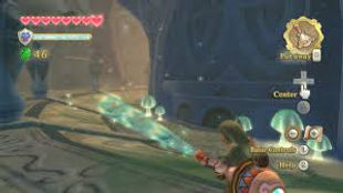
Breath of the Wild (Wii U/Switch)
And finally, we arrive at the Zelda team’s magnum opus: Breath of the Wild. This game shakes up the Zelda formula quite a bit by adding an open world, eliminating traditional dungeons and, probably the greatest of all, adding in an intricate and well refined physics and chemistry engine to the mix.
The HUD of Breath of the Wild is interesting as it is the most unique in the series and adds new elements to the usual HUD’s found in the series. Of course, you have hearts at the top, where they usually are, but this time rupees are not present on the main gameplay HUD but only in the pause menu(as they are not as integral in this game). Under the hearts and on the left side of the screen is your loadout/primary items. The icon for the D-pad is used with item icons on each end of the D-pad to indicate which direction the player must press to choose their item (up for Sheikah runes, right for shields/arrows, left for melee weapons/bows). Under those are the divine powers given to Link and how many times he can use them until they need to be charged. On the bottom right are the shrine locator, temperature gauge, weather/time, noise indicator, and finally the mini map. One might say that all of these are too many to have in one screen, but they all work in tandem to give the player a good indication of their quest status. The indicators are not too big and distracting and are all there to fill a purpose, which they most definitely do. And to those who do not like the presence of these icons and indicators, a pro HUD mode is available which only displays Link’s hearts. Again, having this option is great and the game looks stunning with it activated, but I also standby the fact that the current HUD is not as big of a distraction to the overall game experience as much as it was with Skyward Sword.

Breath of the wild's standard hud.
source: gamespot

Breath of the wild's pro hud
Breath of the Wild’s menus take some notes from Ocarina of Time with different pages for different purposes. There are pages for the adventure log, weapons, armor, treasures and ingredients, dishes/food, and key items in the game. The only problem is that there are so many pages and there is a lot of navigating that must be done to find a desired treasure or dish.

Breath of the wild's menu
Conclusion
The Legend of Zelda has evolved so much over its 35-yearlong history and there have been many ups and downs along the way. One thing is clear for sure though: The Zelda team is incredibly dedicated to giving the player a seamless and memorable user experience. This is seen with the evolution of the HUD’s, UI and overall user experience of each entry in the Zelda series. As seen in the many user interfaces and experiences we have analyzed, we can conclude that Nintendo only wants the best experience possible for all Zelda fans.